Designing a Bank in Motion
UX Design · Design Systems · Motion Design
01. Overview
During my time at Partners Banka, I worked across different parts of the product — from helping shape new interfaces and design system components to turning product scenarios into motion pieces for the bank's marketing and CRM communication.
Since much of the original product work isn't something I can show publicly, this case study focuses on how I worked, the problems I was solving, and what I learned from the experience.
02. Context
Still Being Figured Out
Partners Banka was building a new digital banking experience around a growing range of financial products and services.
The team
I joined the UX team in Prague and worked alongside senior designers on both customer-facing experiences and internal tools used by financial advisors.
The work
My work ranged from exploring new interface concepts and expanding the design system to creating motion content based on real product scenarios.
Startup energy, inside a bank
I joined at a time when the bank was still very young and growing at an unusual pace. It had a lot of the energy I would normally associate with a startup rather than a bank — decisions could move quickly, there was relatively little bureaucracy, and people were trusted to take ownership of what they were working on.
For me, that created a really good balance. I had the freedom to explore and make decisions, but I was also surrounded by experienced people who were willing to challenge my thinking and help me improve it. It was one of the first places where I felt that being early in my career didn't mean I had to wait on the sidelines.
03. Product Design
From Idea to Interface
A significant part of my UX work was taking an idea, requirement or existing product flow and turning it into a complete interface.
Beyond wireframes
Rather than stopping at wireframes, I worked on fully designed screen concepts that could be reviewed and challenged by the wider design team.
Several directions
I usually explored several possible directions before settling on one. The point wasn't simply to create multiple versions, but to understand what worked better, why it worked better, and what each approach meant for the rest of the experience.
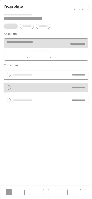
Three directions
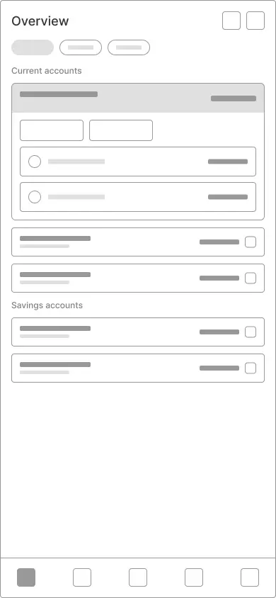
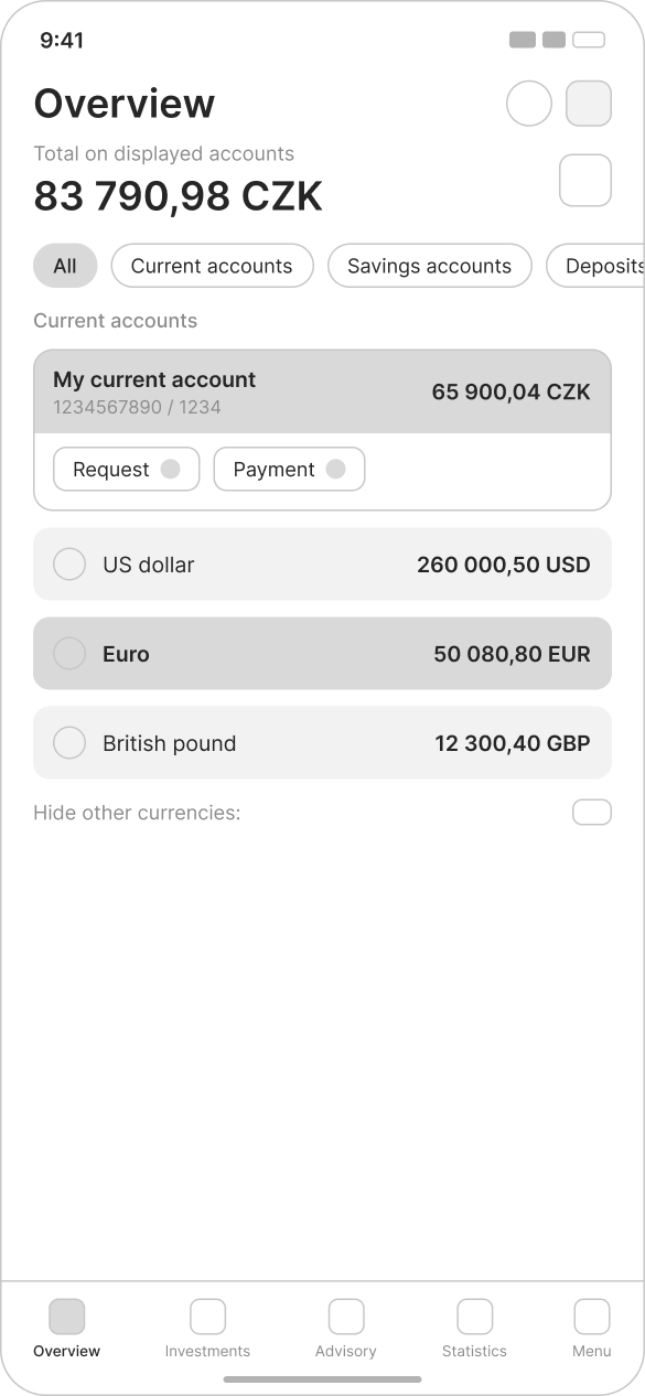
A vertical list with a contextual action bar works reliably at any account count, but the selected card drifts out of view as the list grows.
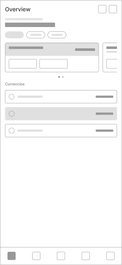
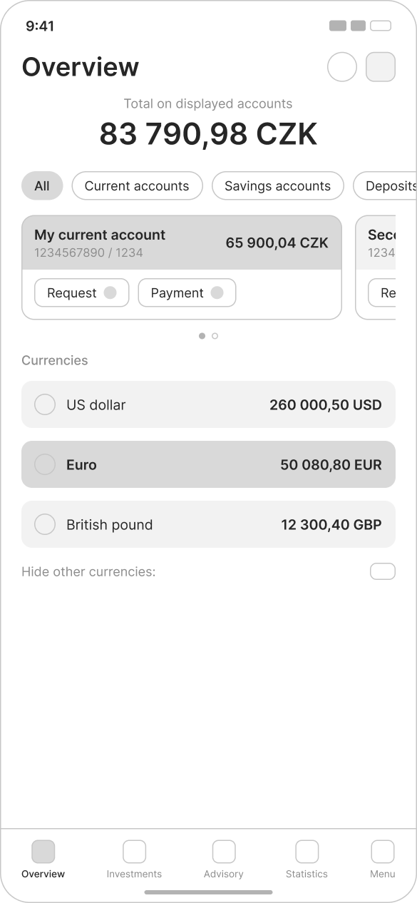
Swipe-to-focus makes selection feel effortless for one to three accounts, but the pattern stops scaling past four as the dots give out.
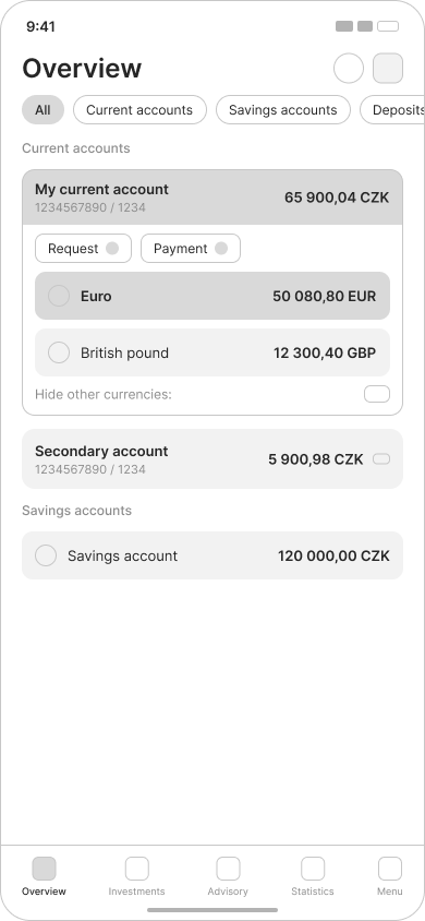
Collapsed-by-default nesting is the only layout that survives the many-accounts case, but it hides all but one account's currencies at a time.
Taken to screens
Wireframes were enough to compare structure, but not to judge the result. Each direction was taken into a fully designed screen so the team could review real density, hierarchy and how the numbers actually read.
Working with senior designers
I worked closely with more senior designers throughout this process. Reviews were an important part of the work — helping me challenge my assumptions, improve the hierarchy of information and understand how individual screens fit into a much larger product.
It was one of the first environments where I started to see design less as creating a final screen and more as a process of exploring, explaining and refining decisions.
04. Design Systems
Designing What Comes Next
I also contributed to the design system as the product continued to grow.
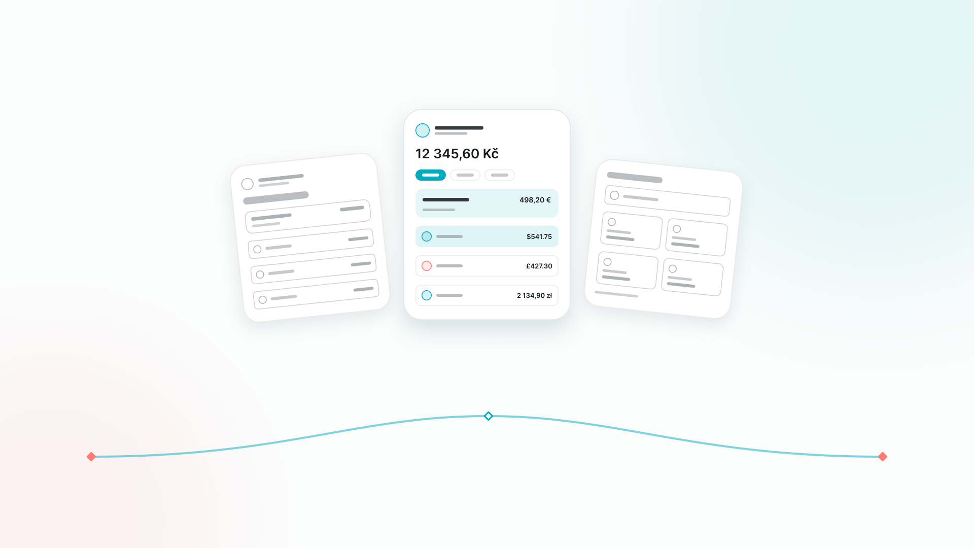
Multi-currency
One of the areas I worked on was multi-currency experiences, creating and adapting components that could support different currencies and future product scenarios.
The real challenge
It wasn't making one version of a component look good. It was making sure the pattern could continue to work when the amount, currency, content or context changed.
One component, six currencies
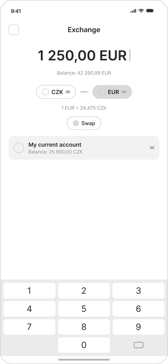
CZK
12 345,60 Kč
Symbol trails · comma decimal
EUR
498,20 €
Symbol trails · comma decimal
USD
$541.75
Symbol leads · point decimal
GBP
£427.30
Symbol leads · point decimal
PLN
2 134,90 zł
Symbol trails · space groups
CHF
465.10 CHF
Code trails · point decimal
Working on these components changed the way I thought about design systems. A good component isn't just a reusable visual element — it's a way of making future design decisions easier and more consistent.
05. Beyond Banking
A very different audience
Not everything I worked on was strictly part of the core banking interface. I also created visual assets and components for experiences aimed at younger users, including custom illustrations and character-based elements designed to fit into the wider product ecosystem.
These projects were a nice contrast to the more functional parts of the product and gave me an opportunity to think about how the same design language could adapt to a very different audience.
06. Motion Design
From Scenarios to Stories
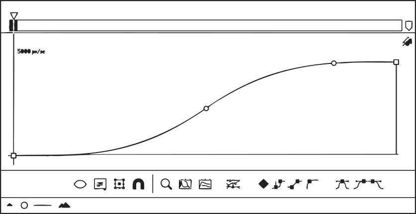
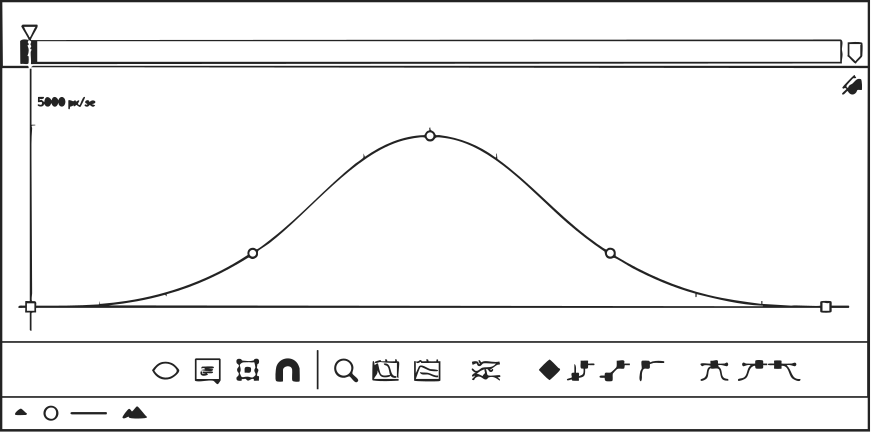
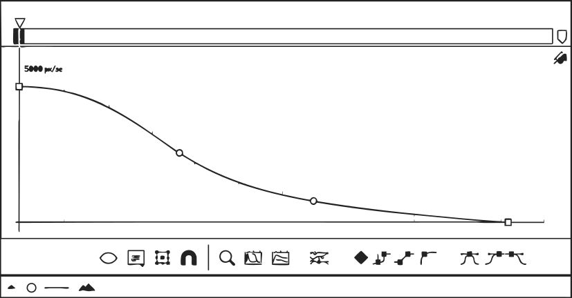
One of the most consistent parts of my work at Partners Banka was creating motion content for the bank's marketing and CRM communication.
These videos usually started with a specific product scenario, often informed by user research. My role was to take that scenario and turn it into a clear visual story that accurately represented the product while still working as a short piece of communication.
07. Storyboard
A repeatable production process
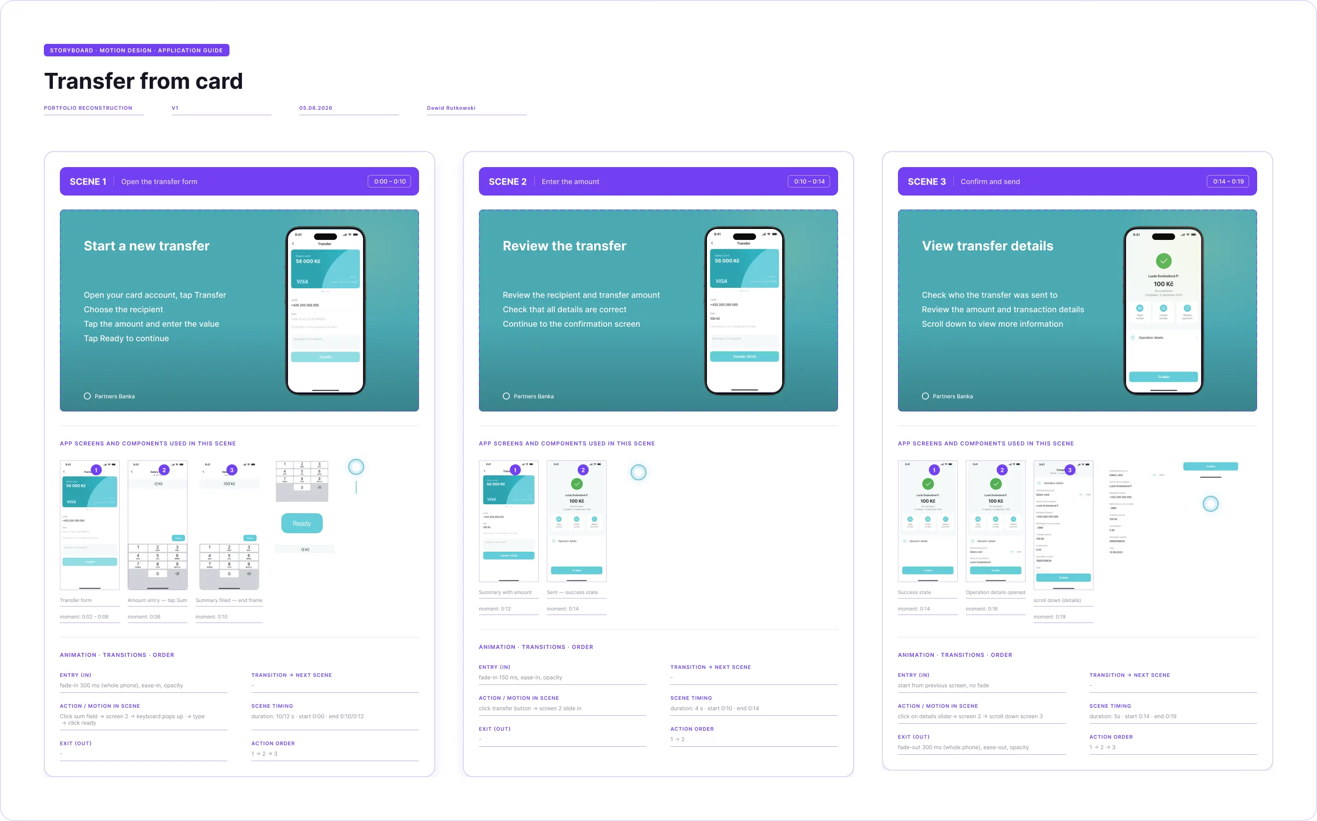
I developed a repeatable process for taking these scenarios from an idea to a production-ready animation.
The first step was creating a standardized storyboard in Figma. I collected the relevant application screens and components from the design system, adapting or creating custom elements whenever something needed to work differently for video.
The storyboard then became a shared space where the narrative, UI, motion and copy could be reviewed before anything moved into After Effects.
From research to release
08. Review
Making the story match the product
Before starting the animation, I worked with the owner of the relevant product or feature as well as UX and UI specialists to make sure the storyboard accurately reflected the actual experience. This was especially important when the video involved flows or functionality that I wasn't directly designing myself.
Feedback from these reviews often meant adjusting the storyboard, changing a screen or refining the interaction before moving into After Effects.
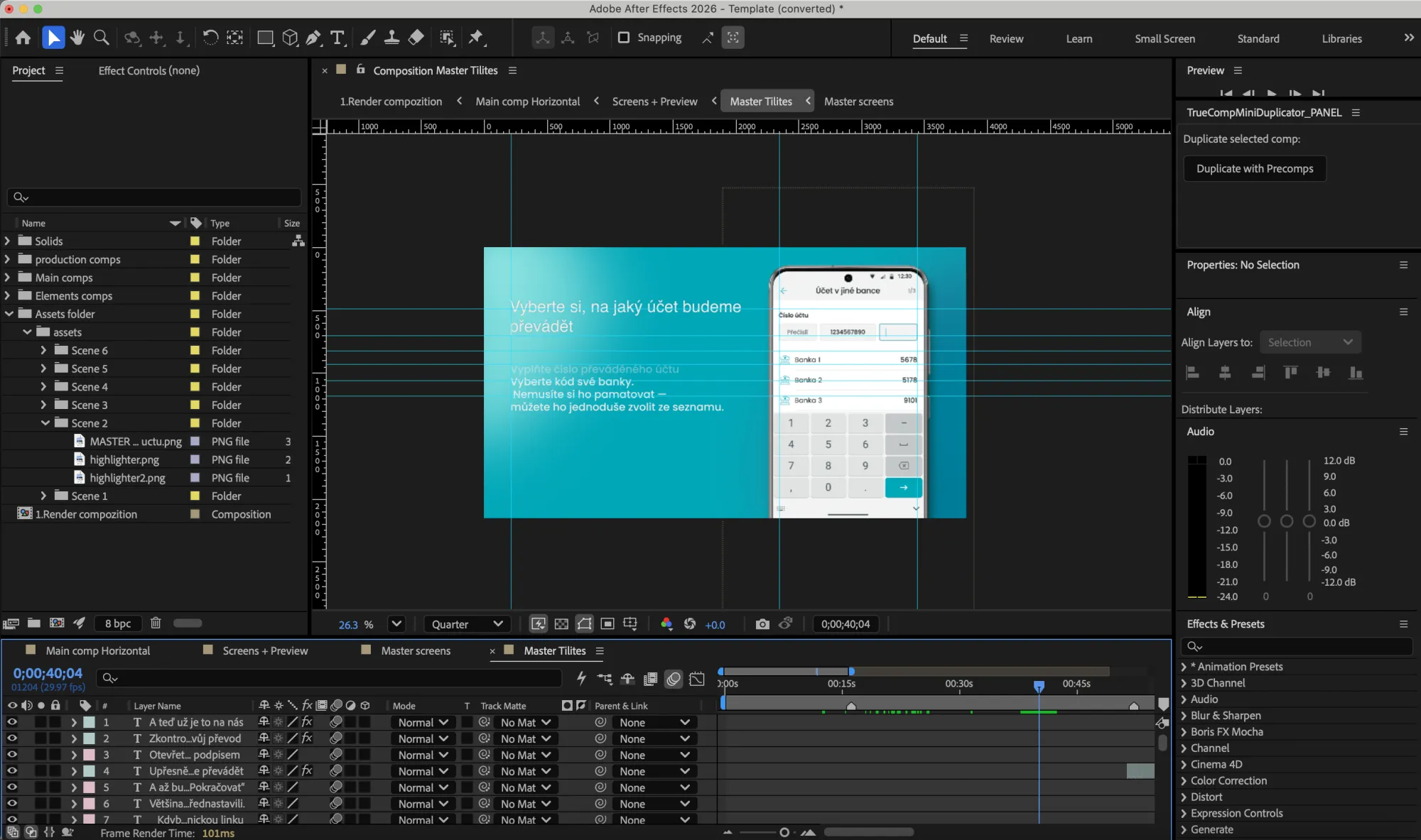
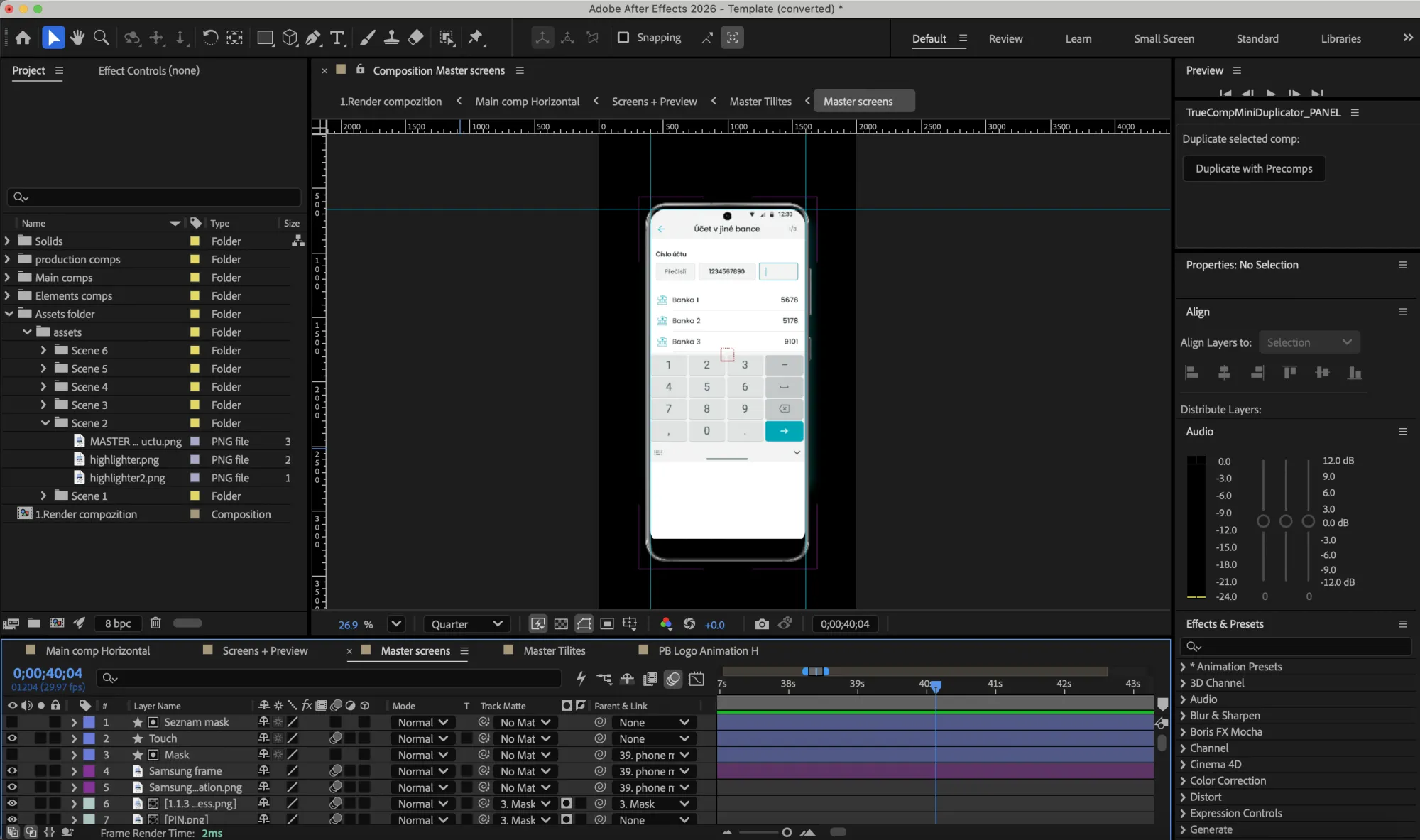
I then owned the motion production itself — taking the approved storyboard into After Effects, animating the interface and delivering the final piece back to the marketing team.
09. Selected Work
The Final Work
The following videos are publicly available versions of work I created during my time at Partners Banka.
10. Takeaways
What I Learned
01
Most of the work happened between teams
A scenario came over from marketing and CRM as plain text. I built the storyboard from the design system, took it to the senior designer who owned that file for feedback on the flows, then went back to marketing for a final look before opening After Effects.
I learned that owning a piece of the work also means owning the process around it. Getting the right feedback at the right point and bringing different perspectives together without losing track of the end result.
02
Exploration works better with something to test
Making three versions of a screen is easy. The harder part is knowing what you are actually looking for between them. I started giving every direction a question to answer: does selection stay visible, does the layout still hold at five accounts, what breaks first. That gave each version a reason to exist and made the comparison much more useful.
It also changed how I made the final call. I was no longer choosing the version that felt best, but the one that held up best against the things the design actually needed to solve.
03
A good storyboard is already good motion
You would be surprised how much motion logic can be settled before After Effects is even open. Timing, order, what enters and what leaves. Working it out in the storyboard saved real production time, and it made reviews sharper: people can react to movement laid out in front of them, not to movement I am describing.
04
Repeatable structure beats raw speed
Tempo matters, but repeatable patterns matter more. In After Effects, a video can either be built from a system or become a pile of one-off compositions. I built a template with auto-alignment and a few custom plugins on top, which made the next video much easier to produce and the whole setup much easier to hand over.
11. Looking Back
Design Takes Many Forms
Partners Banka gave me a look into what product design actually feels like inside a real financial product team. Not just the polished screens that eventually make it into a portfolio, but the iterations, discussions, feedback and constraints behind them.
It was also my first time working inside a design system of that scale and complexity, and inside the Figma structure it takes to keep something that size consistent.
Beyond that, I got to work across very different kinds of design, from product screens and system components to motion and visual storytelling.
And that's probably what I enjoyed most: seeing how many different forms design can take when they're all connected to the same product.